

How to read your included-paper analytics
The Analytics tab of Included papers turns the final set into charts: how the decisions were reached, which criteria and tags carried them, and when and where the papers were published. The papers themselves — with search, filters, and reference exports — live on the Papers List tab, covered in How to review your included papers.
The tiles at the top
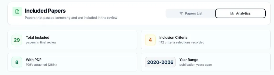
Section titled “The tiles at the top”Four tiles summarize the set before any chart:
- Total Included — papers in the final review.
- Inclusion Criteria — how many distinct criteria justified at least one inclusion, with the total number of criteria selections recorded beneath.
- With PDF — how many papers have a full text attached, with the percentage.
- Year Range — the span from the earliest to the latest publication year.
How the decisions were reached
Section titled “How the decisions were reached”The Decision Methods card splits the set across the three routes into the review, each with a count and a percentage bar:
- Unanimous — every reviewer voted to include.
- Majority Vote — the includes cleared the project’s agreement threshold without unanimity; the card prints the threshold it applied. This route only exists at three or more reviews per paper — with two, there is no majority short of unanimity, so the column reads – with N/A with 2 reviewers.
- Manual Resolution — an Owner or Assistant settled the disagreement in conflict resolution.
Read the split as a health check on your criteria: a set carried mostly by Unanimous decisions means they meant the same thing to everyone, while a large Manual Resolution share means someone had to step in paper by paper — usually a criterion being read two ways. These are the same three routes the Papers List tab records per paper, where the badges read Unanimous, Auto-included, and Manual resolution.

Which criteria and tags did the work
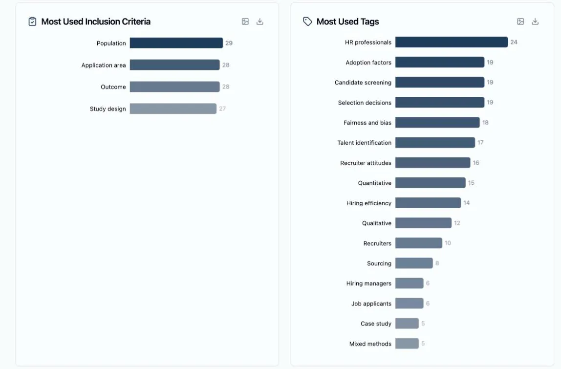
Section titled “Which criteria and tags did the work”Most Used Inclusion Criteria ranks your inclusion criteria by how many included papers each one justified — the boxes reviewers ticked while screening their queues. Hover a bar for the paper count and its share of the included set. Only criteria selected at least once get a bar; if none were recorded at all, the card says so and reminds you criteria are selected during screening.
Most Used Tags does the same for tags, with one difference worth knowing before you quote the numbers: the criteria hover reads Papers and % of included, while the tags hover reads Uses and % of all uses — a share of the tag counts on this chart rather than of the included set, so the tag percentages sum to 100 across the bars. Together the two charts answer the question your Methods section will raise — on what grounds did papers get in, and what did reviewers see in them.
When and where the papers were published
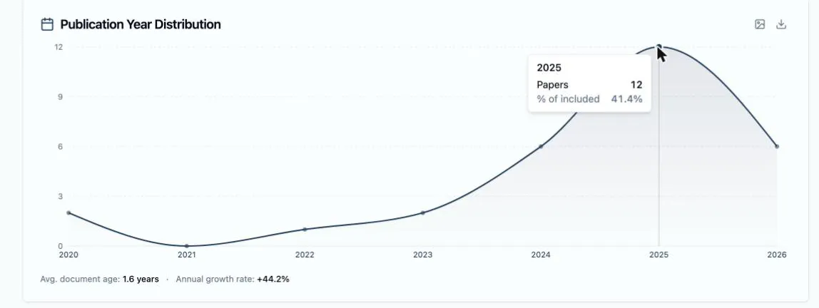
Section titled “When and where the papers were published”Publication Year Distribution plots papers per year across the whole range. Hover any point for that year’s count and share of the included set. Beneath the chart, Avg. document age says how current the corpus is, and once the set spans several years an Annual growth rate joins it. On wide year ranges a slider appears under the chart — drag its handles to zoom into a period.
Top Journals/Sources ranks the ten journals contributing the most included papers, each with its count and share — and a Showing top 10 of N journals footnote when there are more.

Take a chart with you
Section titled “Take a chart with you”Each of the four chart cards — criteria, tags, years, journals — carries two small icon buttons in its header: Export as PNG saves the chart as an image on a white background, ready for a slide or an appendix, and Export as CSV downloads the numbers behind it as a small table, ready to build your own figure from. The summary tiles and the Decision Methods card don’t have them — the export buttons live on the chart cards only.